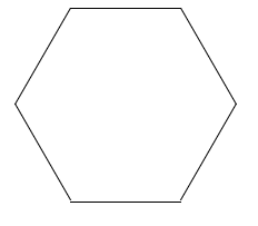
绘制六边形
使用boder绘制六边形
利用伪元素,使用boder绘制两侧三角形
index.html
<div class="hexagon"></div>
index.css
.hexagon {
  position: relative;
  width: 100px;
  height: 173.2px;
  background-color:red;
  margin: 0 auto;
}

.hexagon::before,
.hexagon::after {
  content: "";
  display: block;
  position: absolute;
  top: 0;
  width: 0;
  height: 0;
  border-top: 86.6px solid transparent;
  border-bottom: 86.6px solid transparent;
}

.hexagon::before {
  left: -50px;
  border-right: 50px solid green;
}

.hexagon::after {
  right: -50px;
  border-left: 50px solid green;
}

使用3个矩形绘制六边形
利用伪元素,使用rotate旋转两侧三角形
index.html
<div class="hexagon"></div>
index.css
.hexagon {
  position: relative;
  width: 100px;
  height: 173.2px;
  border-top: 1px solid #000;
  border-bottom: 1px solid #000;
  margin: 0 auto;
}

.hexagon::before,
.hexagon::after {
  content: "";
  display: block;
  position: absolute;
  top: -1px;
  left: 0;
  width: 100px;
  height: 173.2px;
  border-top: 1px solid #000;
  border-bottom: 1px solid #000;
  box-sizing: border-box;
}

.hexagon::before {
  transform: rotate(60deg);
}

.hexagon::after {
  transform: rotate(-60deg);
}